Ready to see the Shifting Sands book covers?
I’m excited (and a little terrified) to finally show them to you. If all you’re here for is the covers, go ahead and scroll to the bottom. But, since I am a word and research person with a show-your-work mindset, I decided I wanted to add a bit more to the reveal by showing some of the inspiration behind it.
Inspiration #1 – The cover mystery issue
One of the things I find most exciting about the way Shifting Sands works is the little surprises and secrets I can hide. As no one will read all six perspectives in one go, it’s almost like there are little Easter eggs hidden in the text that will only be understood if you’ve read some of the other chapters. I even got caught out by a few of them as I was editing! It was very exciting. I wanted the same thing for the cover.
Obviously the details in cover art can hide a lot of secrets. I watched an interesting youtube video once by a self-publishing author who designed her own cover and had hundreds of small images woven around the title text, each a tiny reference to something hidden in the story. Like a mystery for readers to work out along the way. I love that idea, but unfortunately don’t have the art skills to manage it. So instead I decided I would have two covers. The mystery to work out? What makes them switch.
Inspiration #2 – Other book covers
I talked a lot about fantasy book covers the other day and probably revealed my hand a little when I talked about images. I find the busy covers interesting, but definitely lean towards a nice clean cover with one main image. I looked at sooooo many book covers before deciding what to go with, based on a combination of the idea that had been circling in my head for the better part of a year and what my artistic skills could actually manage. A random array of book covers I love that inspired me in different ways:
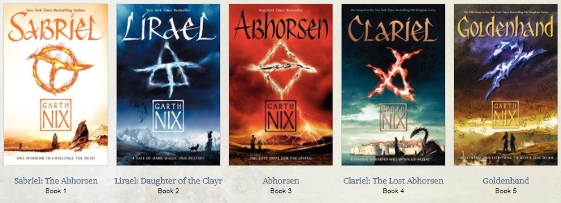
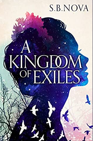
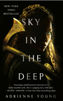
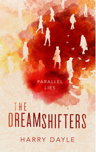
I’m not usually one for Pinterest, but these are just a handful of the covers I saved onto a Pinterest board of inspiration. I definitely found that I’m inclined towards certain trends in cover art though…
Inspiration #3 – Pouring art tutorials
Before I even got to the point of looking at cover art, I had started watching pouring tutorials on youtube. Weird, I know, but very soothing. I love seeing the cells appear once the paint has been spilled across the canvas, with the artist not being sure how it will go when they begin but slowly uncovering something cool as they work. As I watched tutorials making art that looked like fire or water depending on the colour scheme, I started to picture my cover. Maybe if there was a silhouette? And then I saw artists start doing what I’d imagined! This idea was changed and adapted, in large part because I wasn’t sure I could get a good enough image even if I did manage to work out how to do the pouring art myself, but I think the roots can still be seen in the cover.
Inspiration #4 – Bookishness
I guess I should have seen this coming. Despite there being no plans (and no way) to make Shifting Sands into a physical book, I found myself pulling in traits that are distinctly bookish. The bordering, for example, appears on a lot of older book covers and has a bit of a revival in recent years, particularly in fantasy books that draw from myth or history. The embossed fonts – trying so hard to emulate the texture that so many physical books put on their covers. And then I found the mosaic tile in the software I was using. It looked so much like leather and really seemed to pull the design together. But I am aware that it also pushes it further into emulating the bookishness that comes from a physical text, despite belonging to a book that will only ever be an ebook. An interesting future discussion, perhaps?
But now, the cover reveal…
In 3
2
1
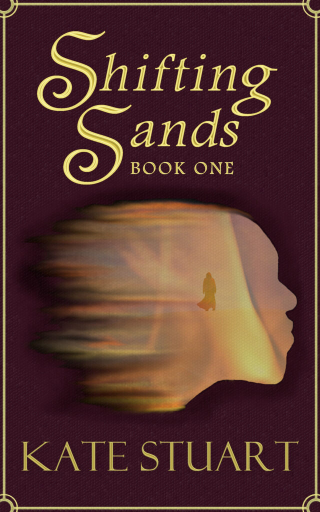
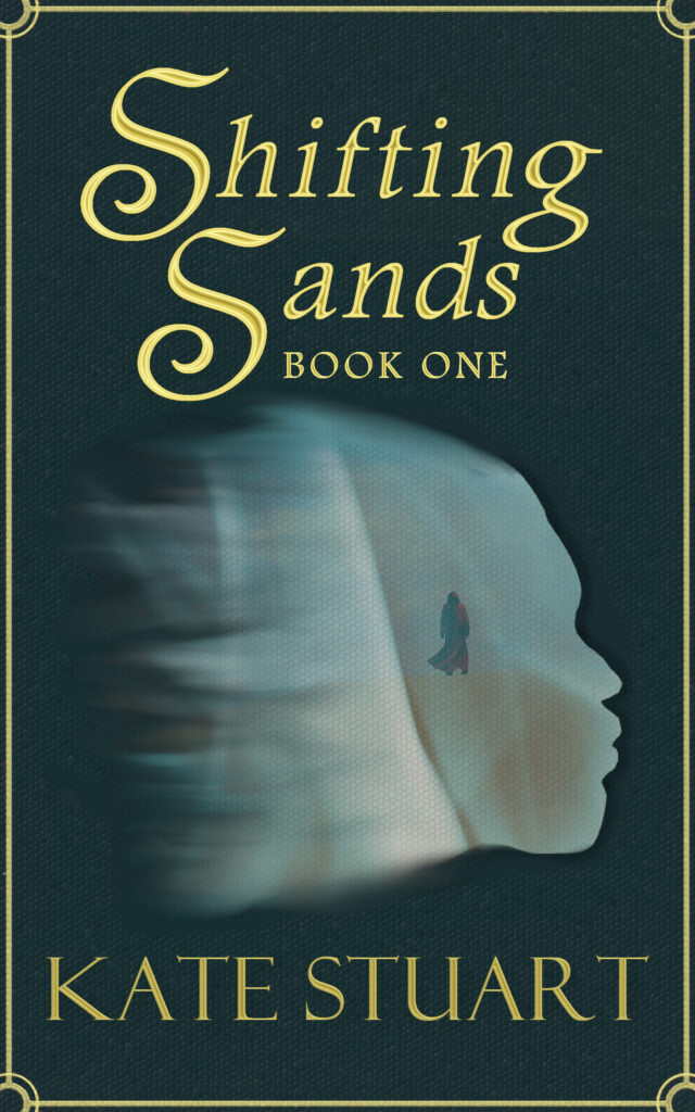
For someone with no art skills, I’m pretty proud of them. What do you think?


I love that you’ve explained how you got to your goal. The end result is amazing. xxx