As I move ever closer to releasing Shifting Sands into the world, I’ve had to move into dealing with some of the details that are waaaaay out my comfort zone. This week, it’s been designing the book covers. While I used to love art in school, I am not naturally blessed with an eye for design, don’t have the funds to pay for someone else to do it for me (this is a PhD project after all), and have felt weirdly exposed through the whole process in a way that I don’t feel about my writing. I’m not fully sure why, but my current theories are that a) I’m more confident in my writing abilities than I usually acknowledge and don’t have the same belief in my artistic abilities, b) stressing over the small details is a form of procrastination, or c) the book cover serves as an introduction to Shifting Sands before the reader even gets to my writing so a lot is riding on it. Either way, I did what I do best when I’m worried about perfecting something: I researched.
What does a book cover do?
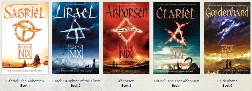
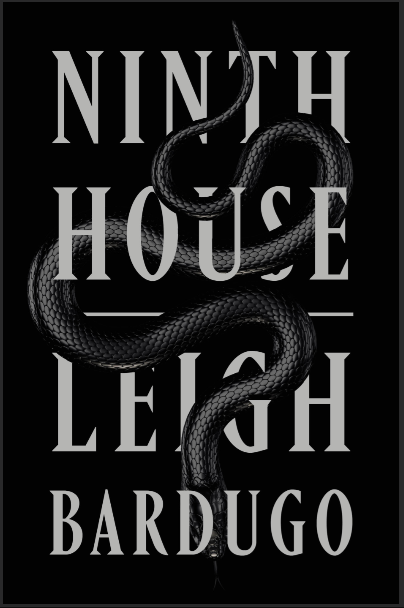
The short answer is that a book cover does many, many things, but I guess I’ll start with the author since that’s my jam. A book cover can be part of the author branding, tying their (potentially vast) bibliography together through similar styling, font choices, or colours. Like, if you tell me certain author names, I will instantly picture the way their names are displayed on their book covers because they are so tied to that branding for me. Think of Enid Blyton’s signature-esque author name, or the boxed Garth Nix – so distinctive! There can be changes to this branding, particularly between countries or when the book gets a film adaptation, but there is usually an attempt to have consistency.

Along with creating a connection between books through the author branding, the cover serves as the reader’s introduction to the story. Genette describes the book cover as the “threshold” that either invites readers in or tells them to turn away. If the reader has no prior experience with the book or the author – which will likely be the case for Shifting Sands 99% of the time – the cover has to quickly communicate with the reader, telling them whether this is a book they want to read through the visual cues it displays.
Contradicting the old adage, we can learn a lot about a book by its cover because of those visual cues. There’s the obvious, of course, communicated through words like the title and author name, but the image(s), font, and layout can say so much before the reader even gets to the words. The cover can tell you that the book is a light summer read, or a hard hitting thriller. It can tell you what that book connects to, emulating familiar covers and genre trends to capture the expected audience. I don’t know who else was reading YA fantasy in the heyday of the Twilight franchise, but at that time you could tell that a book was a YA supernatural romance due to the similarities in cover style – usually black/dark covers with a single central image that was usually white or red. For a new author seeking to gather an audience and find their place in the market, this means trying to capture these similarities, while also establishing their author brand and standing out enough to draw a reader in.
What makes a fantasy cover?
If I’m feeling any sort of doubt, I tend to deep-dive into research mode. Designing the book cover(s) for Shifting Sands was no different. Since it’s a fantasy novel (well, novella), I looked up lots of advice about designing fantasy covers and looked at a whoooole lot of examples. I’d had some ideas about what I wanted to do for a while (post on that coming soon!) but I wanted to draw on that collective fantasy history to help it fit.
Colours
Fantasy books tend to use bold colour palettes. If you look at the GoodReads Choice Awards 2019 for Fantasy as an example, you’ll see lots of strong colours dominating the covers, usually with one central colour and the limited steps outside this colour emphasising contrast. There are obviously covers that deviate from this – Katherine Arden’s The Winter of the Witch feels comparatively softer, with less contrast than the others, emulating some of the older classic fantasy covers of days gone by – but saturated colours, usually on the darker side, seem to be much more in demand right now.
Images
The imagery used in a fantasy book cover should tell the reader about your story and so quite often becomes the way the author indicates sub-genre. The YA Paranormal Romance trend of the Twilight era shows you how powerful this is – most books of that sub-genre followed that pattern to capture the huge readership that ballooned at that time. As the images used can be so specific to the book and sub-genre here, I have to be quite general, but there seem to be a few contrasting trends going on in fantasy at the moment.
The first is the prominent focal image. Quite often this is the protagonist, or an item considered important to the story or title. R. F. Kuang’s The Dragon Republic, Rebecca Roanhorse’s Black Sun, and Heather Walter’s upcoming 2021 release, Malice, all use this trend to create punchy covers that draw you in and show just a glimpse of something important in the novel. Font is often used to its absolute maximum effect with these cover styles.

In complete contrast to this fairly simple focal image style, we have covers with intense patterns and busy images. They’re almost overwhelming with the content, font often linking in to the image. Some examples of this would be Marlon James’s Black Leopard, Red Wolf and Alix E. Harrow’s The Ten Thousand Doors of January, but the trend does seem to be lessening as we move in to 2021 releases. Elements still remain, with many upcoming releases featuring a number of images and patterns together, but not in such an overwhelming way.
There is an interesting turn towards the more classic fantasy scene-type covers as we move into 2021. Obviously I mentioned 2019’s Katherine Arden’s The Winter of the Witch above, and Michael J. Sullivan’s Age of Legend also went with a more classic fantasy cover, but 2021 seems to be pushing this turn further forward and modernising it, with a number of more fantasy scene-style and illustrated covers. It’ll be interesting to see where this goes.
Font
Font can also vary according to sub-genre – urban fantasy, for example, tends to favour bold and quite modern fonts, and there are some like The Poppy War that go for a font that feels more fitting to the storyworld – but fantasy is most known for having elegant, often medieval-inspired serif fonts. Weighty. Classic. Often embossed or looking chiselled out in some way. This may be because of the genre’s tendency to lean into medieval-Europe-with-magic settings – and I expect that the growing deviation is partially due to the fact fantasy is finally diversifying and growing away from that obsession – but it is a handy shortcut to scream at your reader that this is a fantasy book.
As I mentioned above, font has been a really big part of cover design in the past couple of years and this trend seems likely to continue into 2021. I’m someone who loves pretty writing, so this makes me happy!
There are obviously so many details that could go into a fantasy book cover but these were just some of the things I noticed from my research. I’m planning to write another post about the inspirations behind the cover(s) for Shifting Sands but, if you’d like an early sneak peek, I’ll be sending out a newsletter later today where I’ll reveal them both. Sign up to see!
What are some of your favourite book covers?


Hi Kate, this is your Uncle Bill from Canada. I am interested in the work that you are doing right now and wish to give you a contact to design your book cover. My son, Mitchell, is an excellent professional artist and has done several book covers. He is a busy artist with international contacts also works with multi-media. For the movie “Elysium”, Mitchell was responsible for international space station concept and artwork. Contact him through facebook and see if he can fit you in.
p.s. your latest family picture in facebook is beautiful.
Hi Uncle Billy!
Mitchell’s designs are amazing and I love seeing them when he posts them on Facebook. I wouldn’t want to ask him to do the covers for me though – from a personal point of view, I don’t like asking other people in the arts to do work for free and I unfortunately wouldn’t be able to pay Mitch. From a research POV, me doing the covers myself probably also reflects the typical experience of a poor self-publishing author. Most other writers probably aren’t lucky enough to have such an amazing family connection! Though I’m sure he could give me plenty of feedback on the covers I have done haha
Miss you all and hope the family is doing well!
Best wishes,
Kate X